Student Responses: Janis Joplin and Jimi Hendrix
This column is part of an occasional series in which Washington-area university students discuss works on display in the National Portrait Gallery.

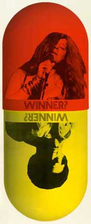
L & S Productions, 1970 / Color
photolithographic halftone poster /
National Portrait Gallery, Smithsonian
Institution / © 1970 L & S Productions
This blog post is written by Jamielyn Smith, a graphic design student at George Mason University. She writes about this 1970 poster of Janis Joplin and Jimi Hendrix. The poster is on display in the National Portrait Gallery’s exhibition “Ballyhoo! Posters as Portraiture,” on the museum’s second floor.
Smith’s article is reprinted here, with her permission—it was originally published in Writing for Designers, the class blog of GMU’s graphic design course AVT 395-4. Writing for Designers covers many topics in graphic design, and includes more student-written articles about the “Ballyhoo!” exhibition.
You might think that a poster featuring Jimi Hendrix and Janis Joplin, two of the most recognizable 1960s rock icons, would include the flamboyant colors and embellishments associated with their music. There is, however, absolutely nothing psychedelic about the L&S Productions poster entitled Winner? Created in 1970, the year Hendrix and Joplin both died of overdoses at the age of twenty-seven, Winner? presents a critical look at the drug-filled lifestyles led by these rock legends. As part of the National Portrait Gallery’s “Ballyhoo! Posters as Portraiture” exhibition, this piece displays its message with a fairly basic graphic palette of three colors, three photographs, and one word repeated twice.
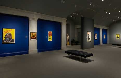
Located on the back wall of the show room, Winner? stands out due to its simple, effective design. Contained within a red and yellow elliptical pill shape are photographs of Joplin and Hendrix. Both musicians are performing, their eyes closed and faces half covered. A sharply focused photograph of Joplin fills the red, top half of the composition, with the word “Winner?” centered underneath her image. An upside-down, softly focused photo of Hendrix appears underneath, on the yellow, bottom half of the pill—the word “Winner?” is also upside down and placed with his image.
The orientation of the photographs allows the poster to be flipped, while maintaining its imagery and purpose. The clever presentation symbolizes how easy it is to go from the top to the bottom. The careers of Hendrix and Joplin were at an all-time high in 1970, but everything ended in an instant because of their addictions. Along with the passing of Jim Morrison, their deaths helped bring the potential downside of drug use to the public’s attention. Furthermore, the elliptical shape means that the pill could continue to flip, representing the continuous cycle of drug abuse.
The restricted color palette and simplicity set this piece apart from the other posters in the exhibition, particularly the ones that also depict musicians and iconography from the 1960s. Posters from this era are usually colorful and saturated with surreal imagery, optical illusions, and kaleidoscopic swirling patterns. This complete lack of white space makes the viewer feel overwhelmed with imagery. They also feature hard to read, warped, organic typography. Therefore, it is especially shocking to see the king and queen of stoner rock in such an austere context.
Although this poster was created almost forty years ago, the message it communicates is still relevant today. The poster’s clean design references the 1960s in a subtle way that makes it appealing to contemporary viewers. Likewise, Janis Joplin and Jimi Hendrix continue to inspire modern audiences with their music. There is no question that Winner? is timeless.
